The Ask
As a Senior Designer at ZoomInfo, I collaborated with the Creative team to lead a comprehensive revision and modernization of the company's brand identity and visual asset library, establishing a more cohesive, polished, and strategically aligned marketing presence across all channels and touchpoints. Our work began with foundational design principles that guided the evolution of the logo, wordmark, product marks, and typography — modernizing the overall aesthetic while staying true to the brand's core.
From there, we refined the color palette and introduced unified design elements including iconography, product illustrations, and a defined photography style, creating a consistent and compelling presence across every platform. The project culminated in a fully refreshed brand book, giving the team a clear, comprehensive guide for carrying the identity forward.
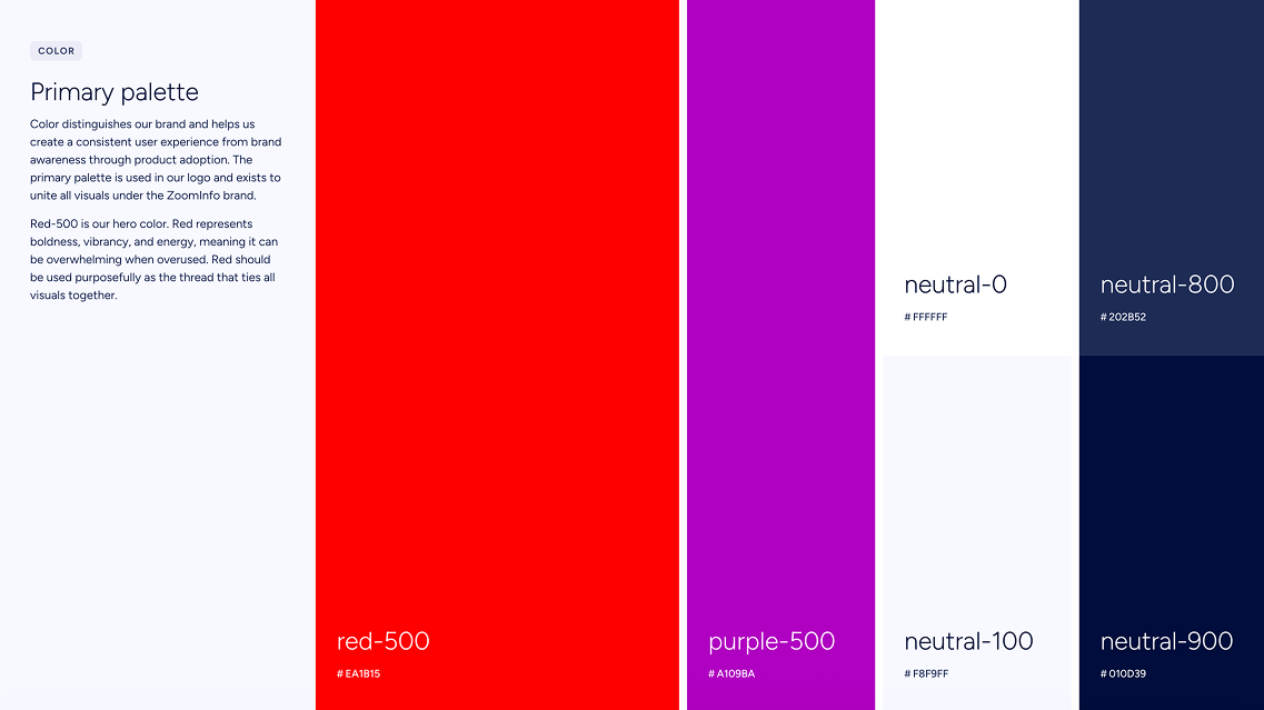
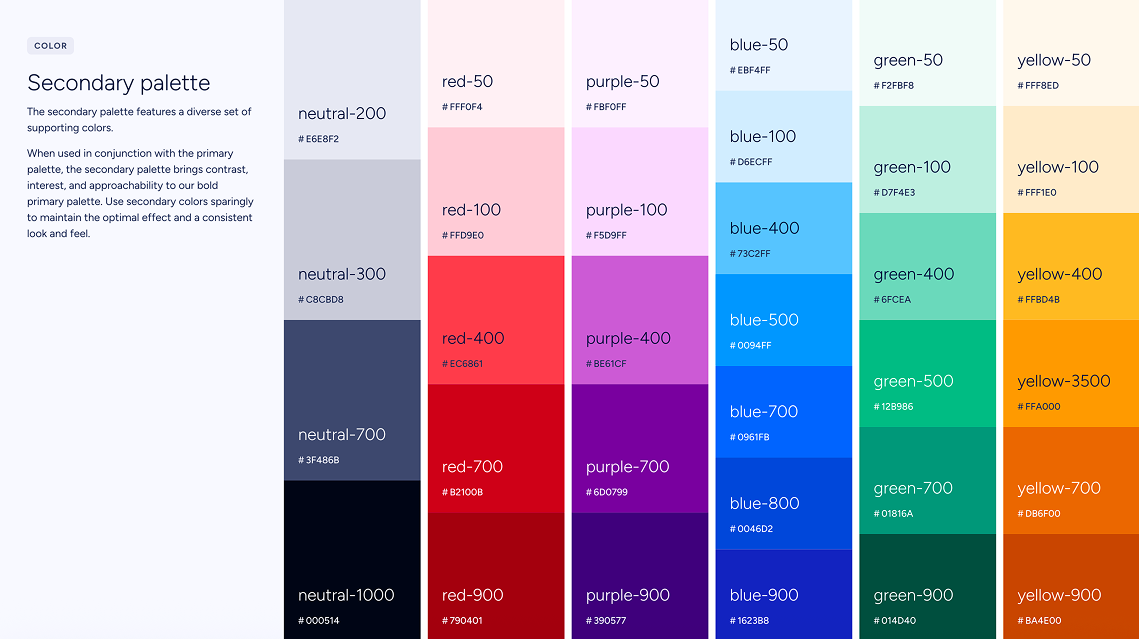
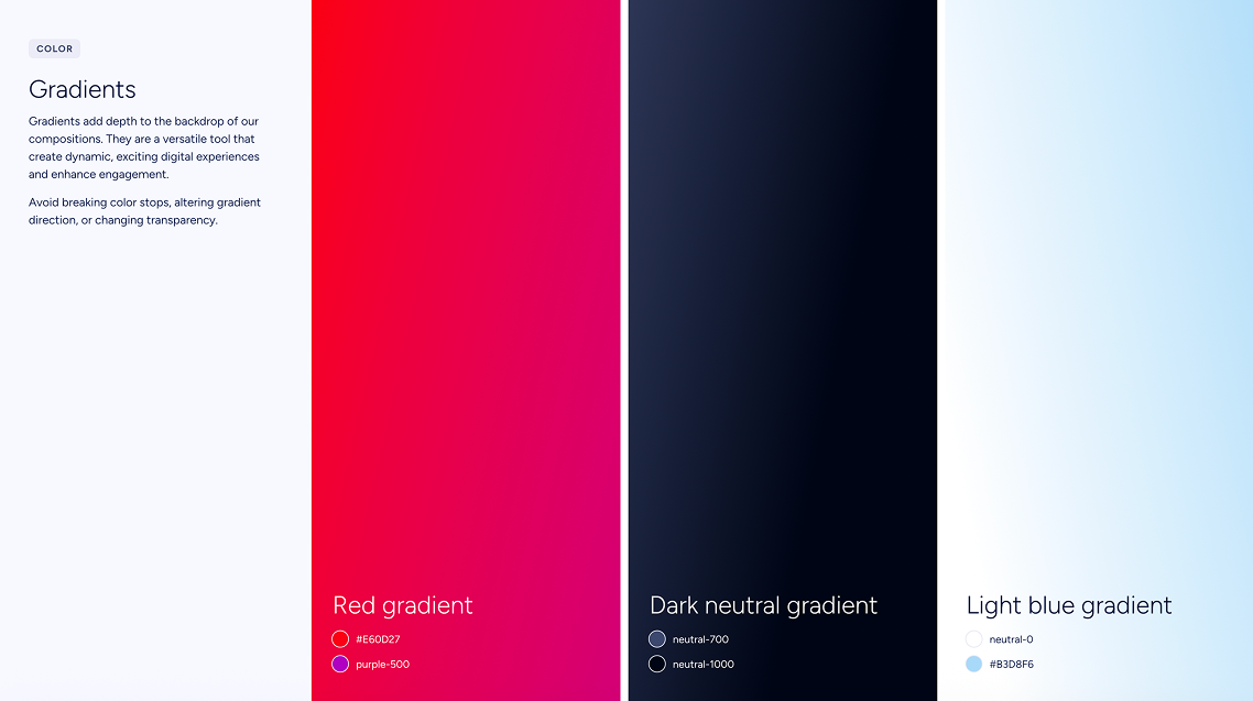
Color
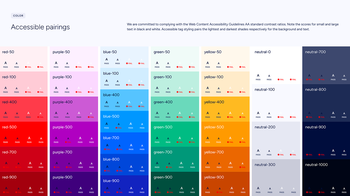
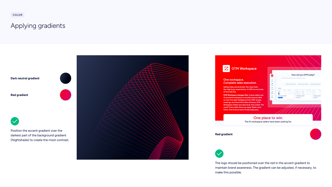
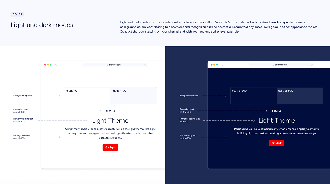
The rebrand brought a complete overhaul of our color system. Where each product once operated under its own palette — fragmenting brand recognition — the new system introduces unified primary, secondary, and extended palettes, paired with comprehensive usage guidelines and AA accessibility standards. It also bridges a longstanding divide between Marketing and Product, bringing their color systems into alignment for the first time.
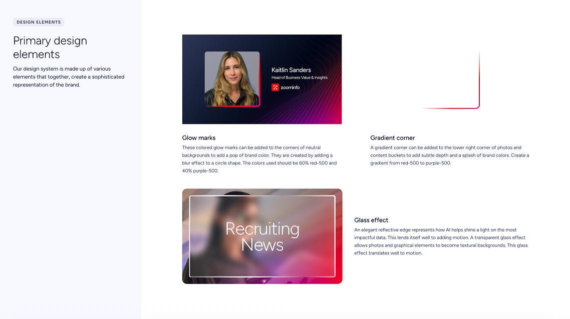
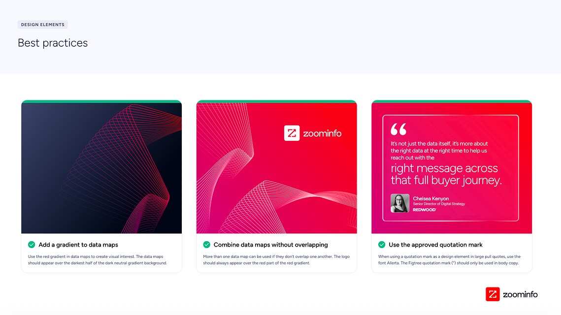
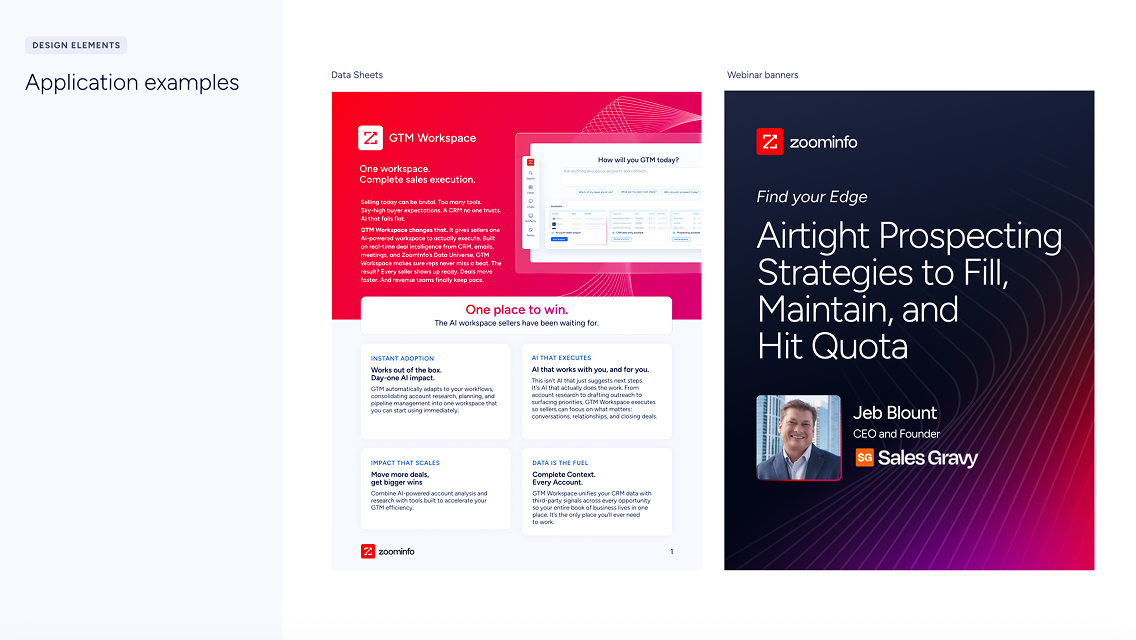
Design Elements
Our refreshed design language makes a deliberate shift: from flat to dimensional shapes that speak to growth, progress, and sophistication. Go-to-market has always been about momentum, and our updated elements bring that to life visually — conveying depth, motion, and precision that mirror the complexity of a modern go-to-market platform.

Photography
The photography guidelines were refreshed around a single core idea: putting people at the center of the story. The driving insight is that photography is one of the most direct ways to show — not just tell — how the mission creates real impact. Rather than abstract or product-focused imagery, the updated style prioritizes human faces, moments, and emotions that audiences can see themselves in.
The shift was from a more generic visual approach to one that is intentionally human-centered, meaning imagery now leads with authentic human moments rather than settings or products. The style is designed to serve storytelling first — each photo should carry emotional weight and move a narrative forward, making viewers feel collaborative, empowered, and successful.


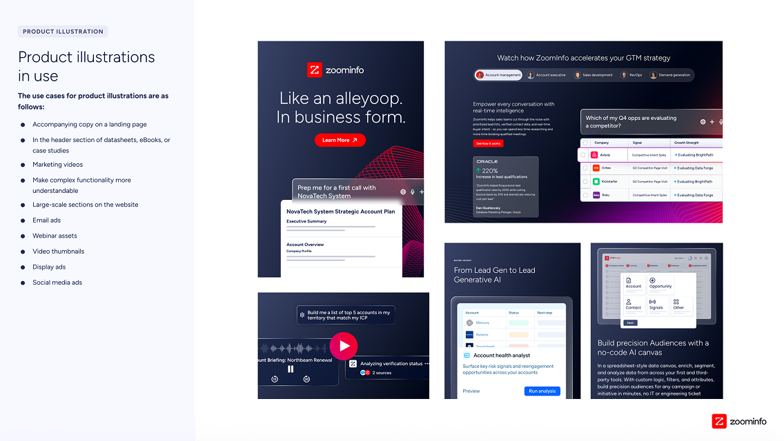
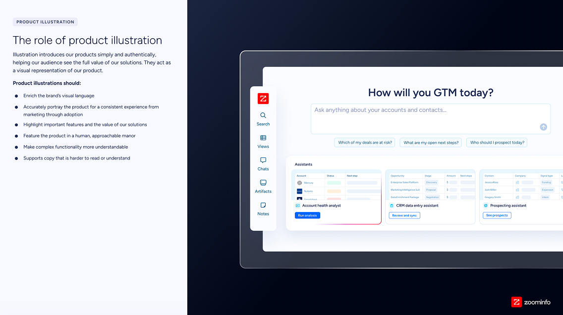
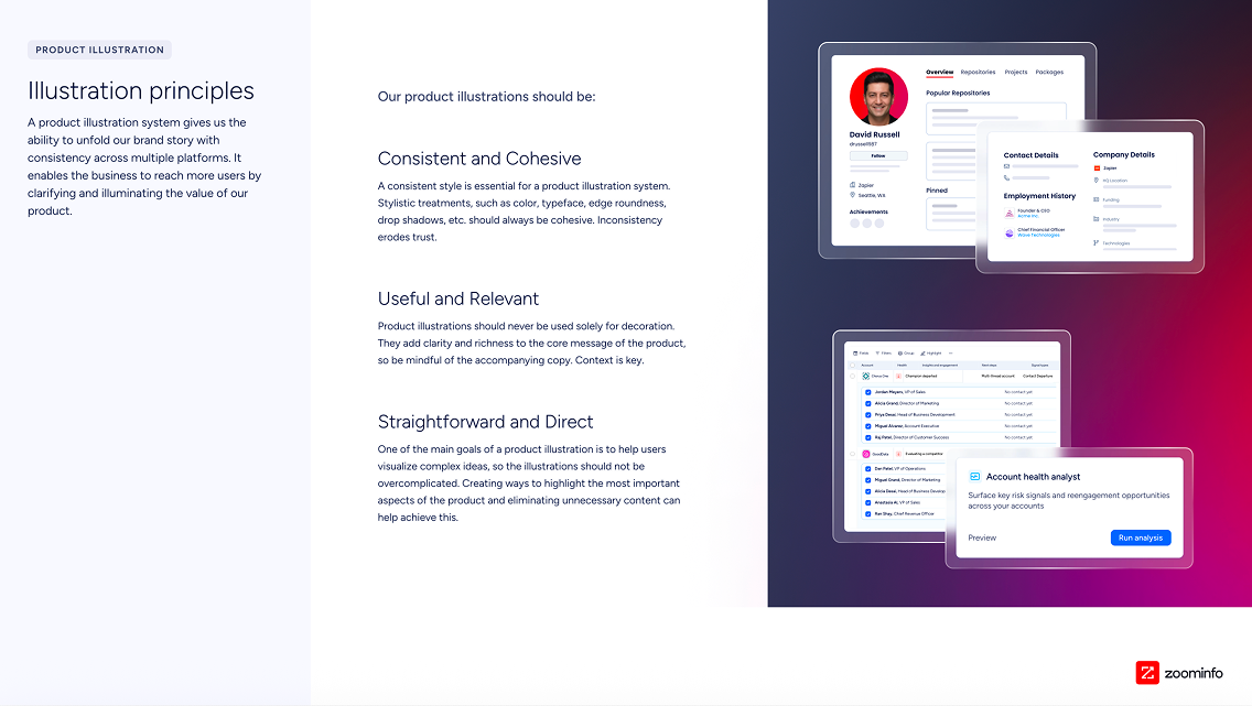
Product Illustration
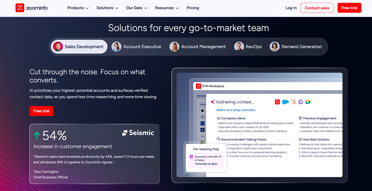
The updated Product Illustration guidelines reframe illustrations as a strategic communication asset rather than a decorative element. They now serve as a direct visual proxy for the product — accurately portraying what users will actually encounter while enriching the broader brand visual language. The biggest operational shift is the call for consistency "from marketing through adoption," closing the gap where polished marketing visuals often bear little resemblance to the actual product. Compositions should also be intentional, directing the viewer's eye toward key features and value rather than generically showing an interface.
Beyond accuracy, illustrations now take on a defined functional role alongside copy: making complex functionality more understandable and supporting content that is harder to digest. Paired with the directive to feature the product in a human, approachable way, this positions product illustration as a tool that builds trust and comprehension across the full user journey — from a prospect's first touchpoint all the way through adoption.