The Ask
As a Senior Designer at ZoomInfo, I partnered with the creative team to reimagine the company's primary brand from the ground up. Working across marketing, web, product, and content channels, we evaluated what existed, identified gaps, and evolved the core assets, visual guidelines, and tone of voice into something more cohesive and refined — folding sub-brands into a single, unified system in the process.
To support adoption across the organization, we developed a brand field guide designed for easy self-serve use by both internal teams and external partners. From there, we set measurable goals to track impact: 90% channel consistency within the first year, steady growth in employee template usage month over month, and a longer-term lift in brand recall and mental availability in market.
The Problem
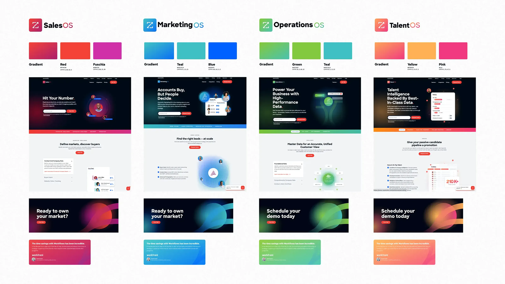
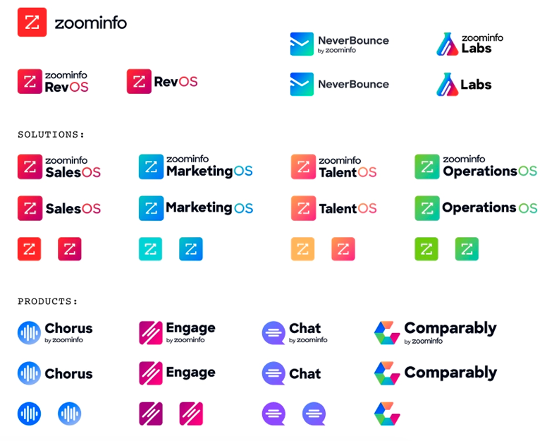
ZoomInfo's visual brand expression failed to keep up with the evolving product suite. The visual brand was disjointed by a history of acquisitions and products, each with their own sub-brand. This meant that the vast majority of ZoomInfo assets in market were void of the ZoomInfo name.
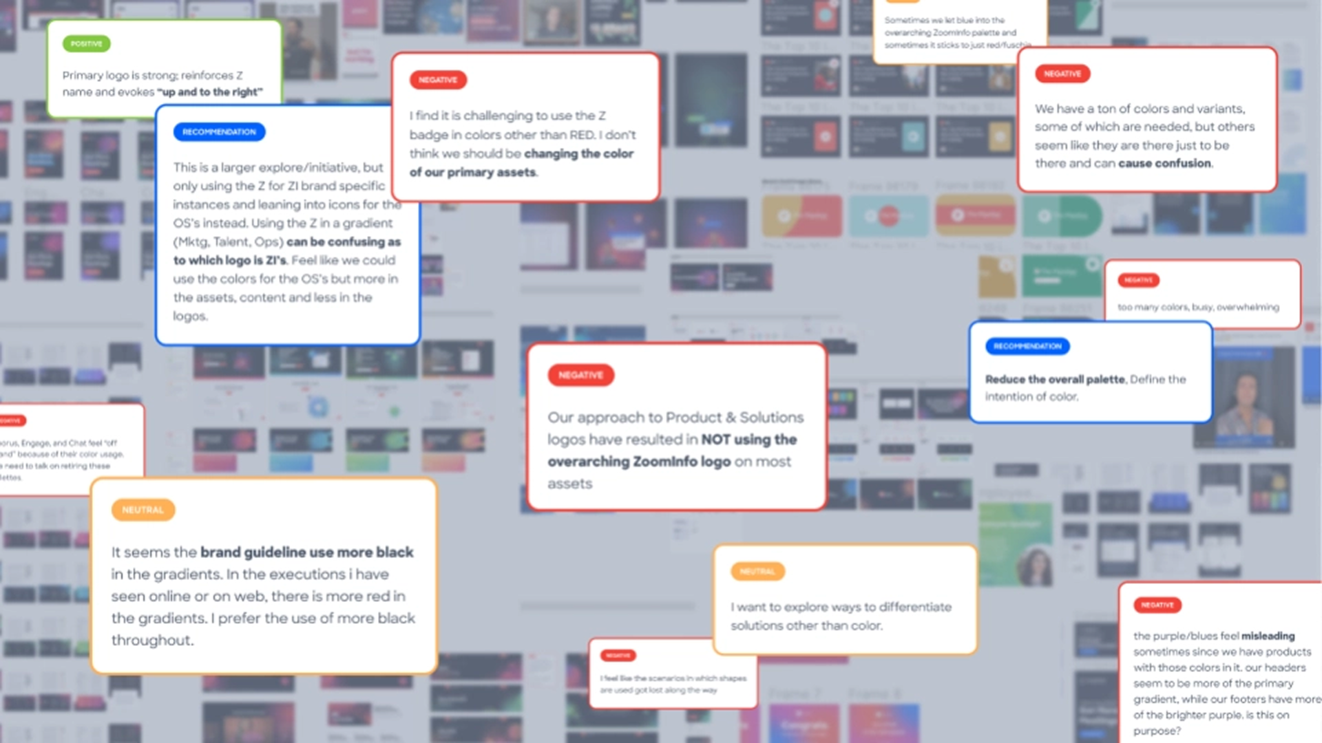
On a visual front, the brand expression wasn't particularly unique. For users of the brand across the company and external partners, the visual identity lacked the needed guiding principles for a scaling company.
On a visual front, the brand expression wasn't particularly unique. For users of the brand across the company and external partners, the visual identity lacked the needed guiding principles for a scaling company.
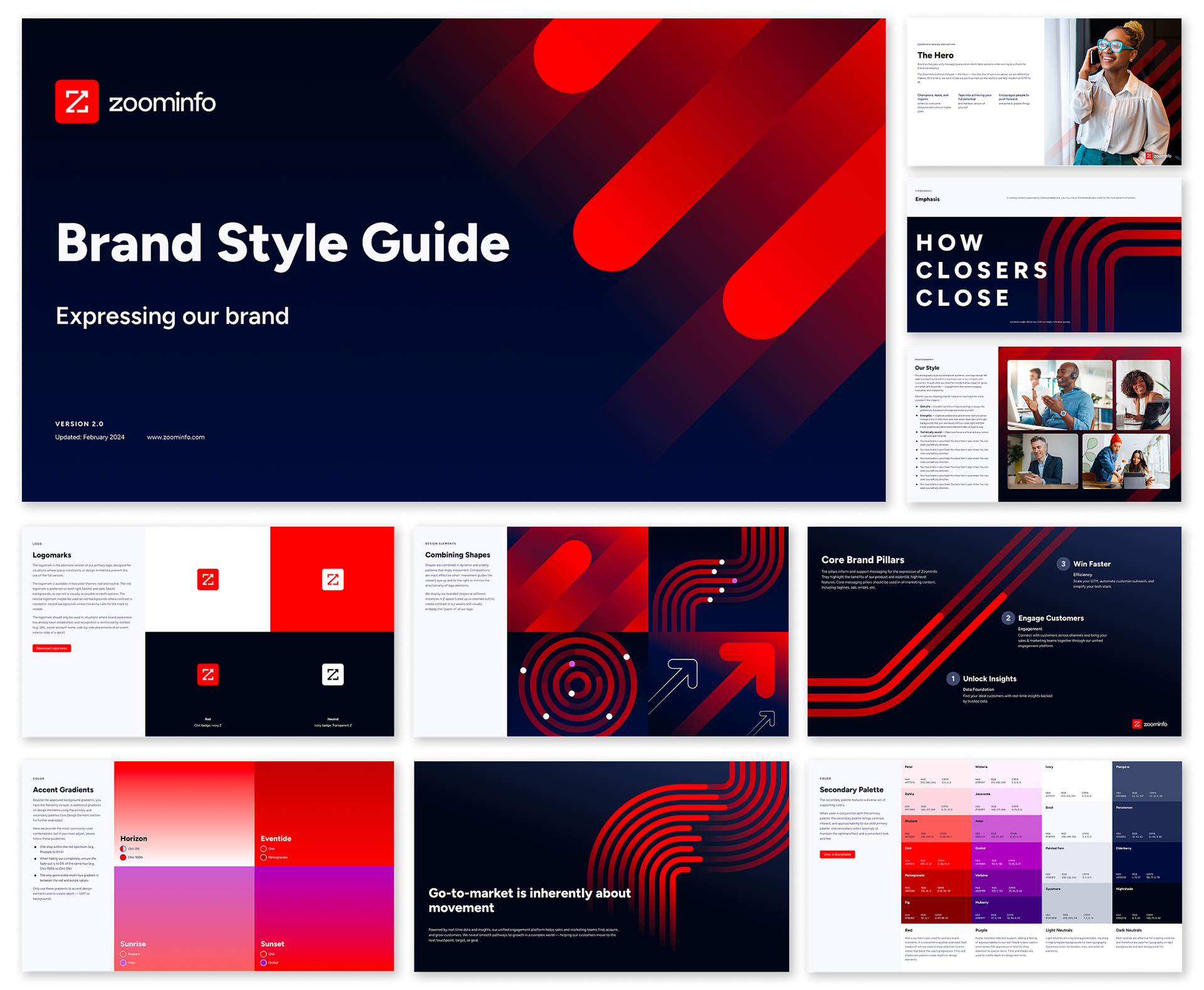
The Foundations
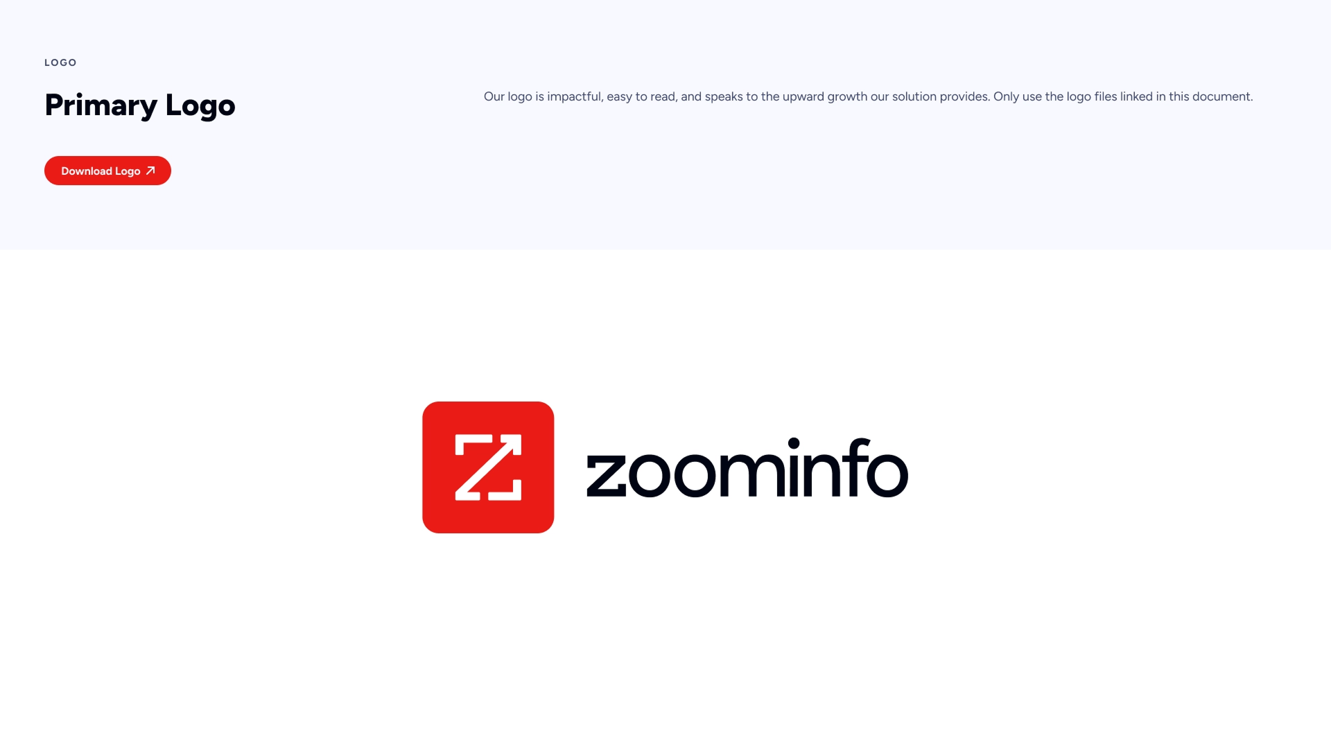
Together with the Creative team, we set out to reimagine ZoomInfo's visual identity. We sharpened the primary logo, unified the company under a new typeface, and brought intention to every contrast ratio and visual proportion.
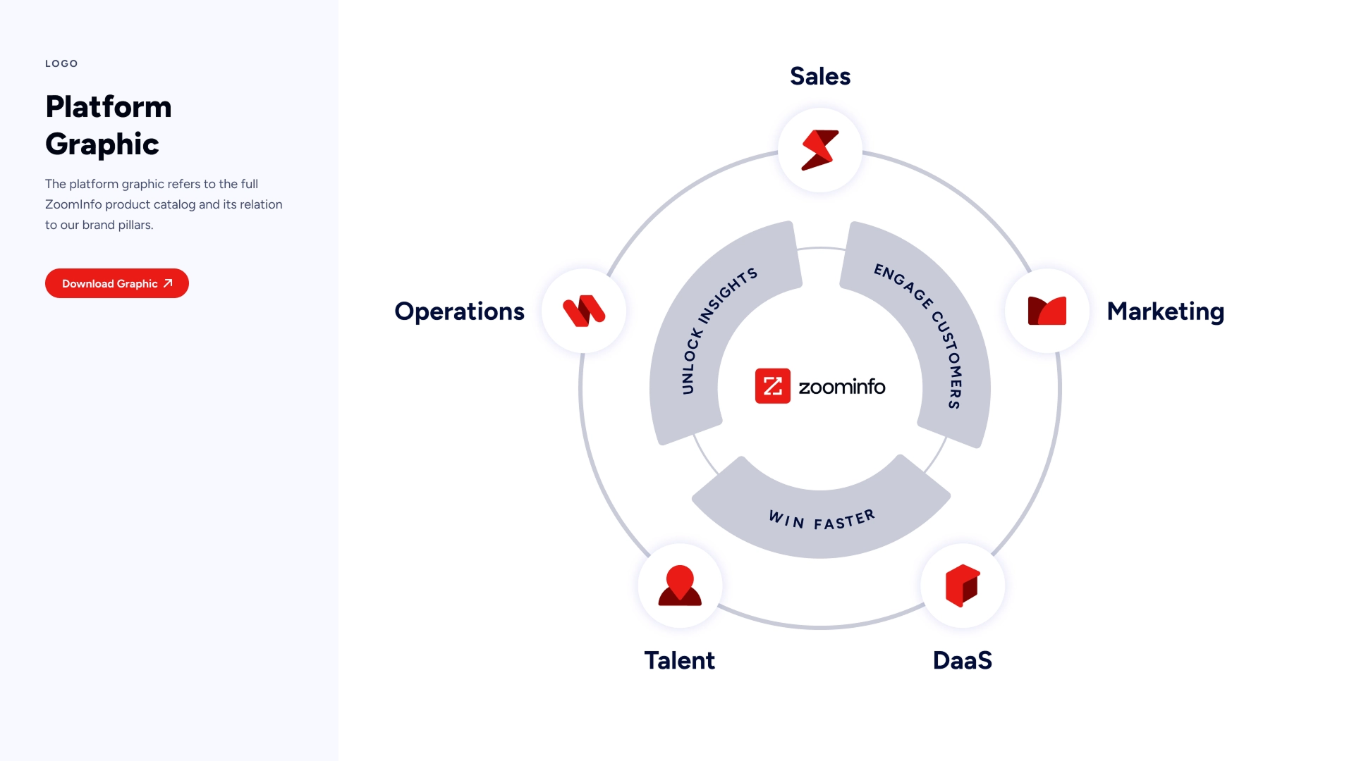
A year of deliberate work produced two lasting artifacts: a 120+ page Brand Book and a robust Figma Design System. Along the way, we filled a long-standing gap in the brand architecture and brought elegant simplicity to our growing product family.
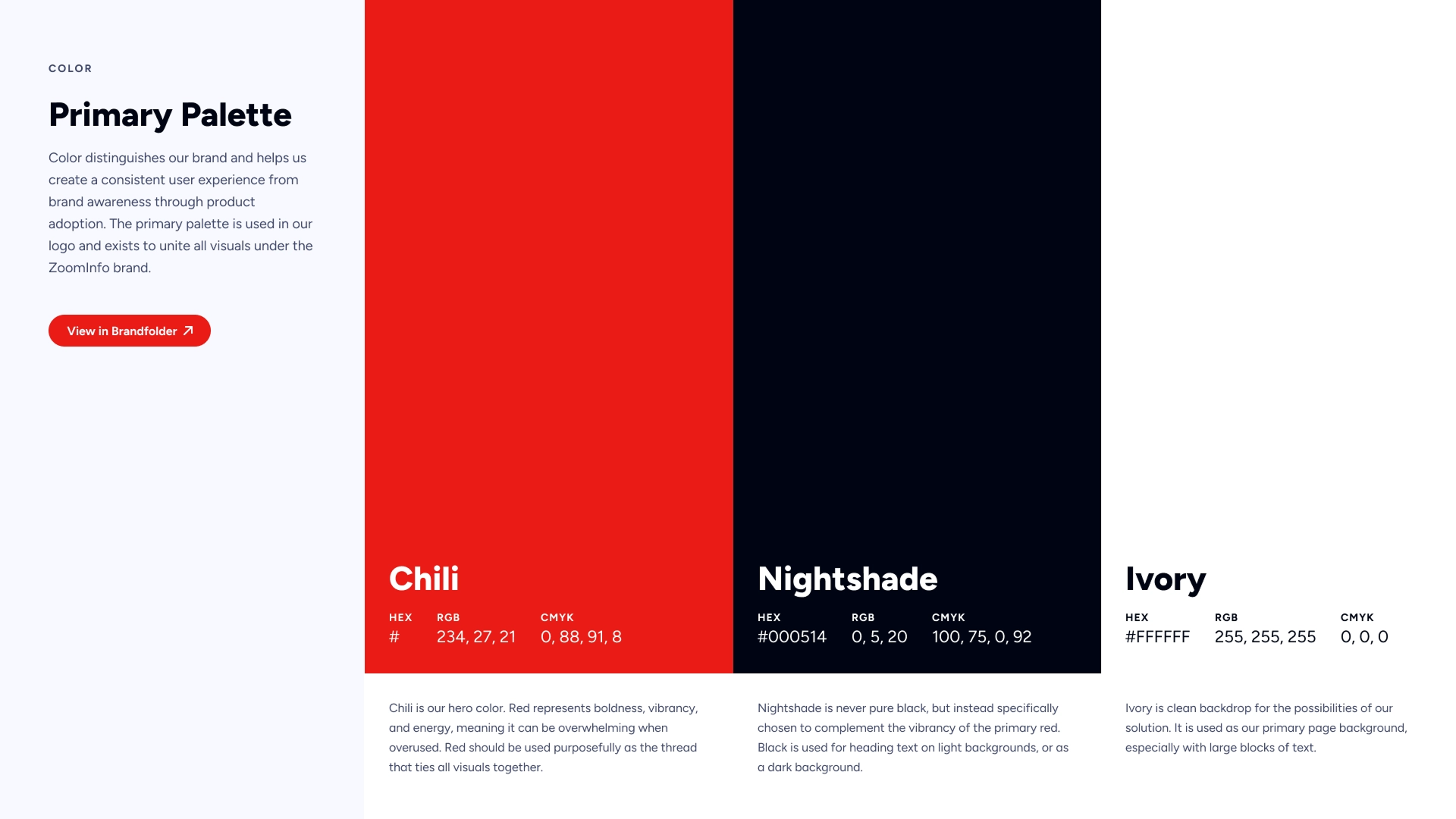
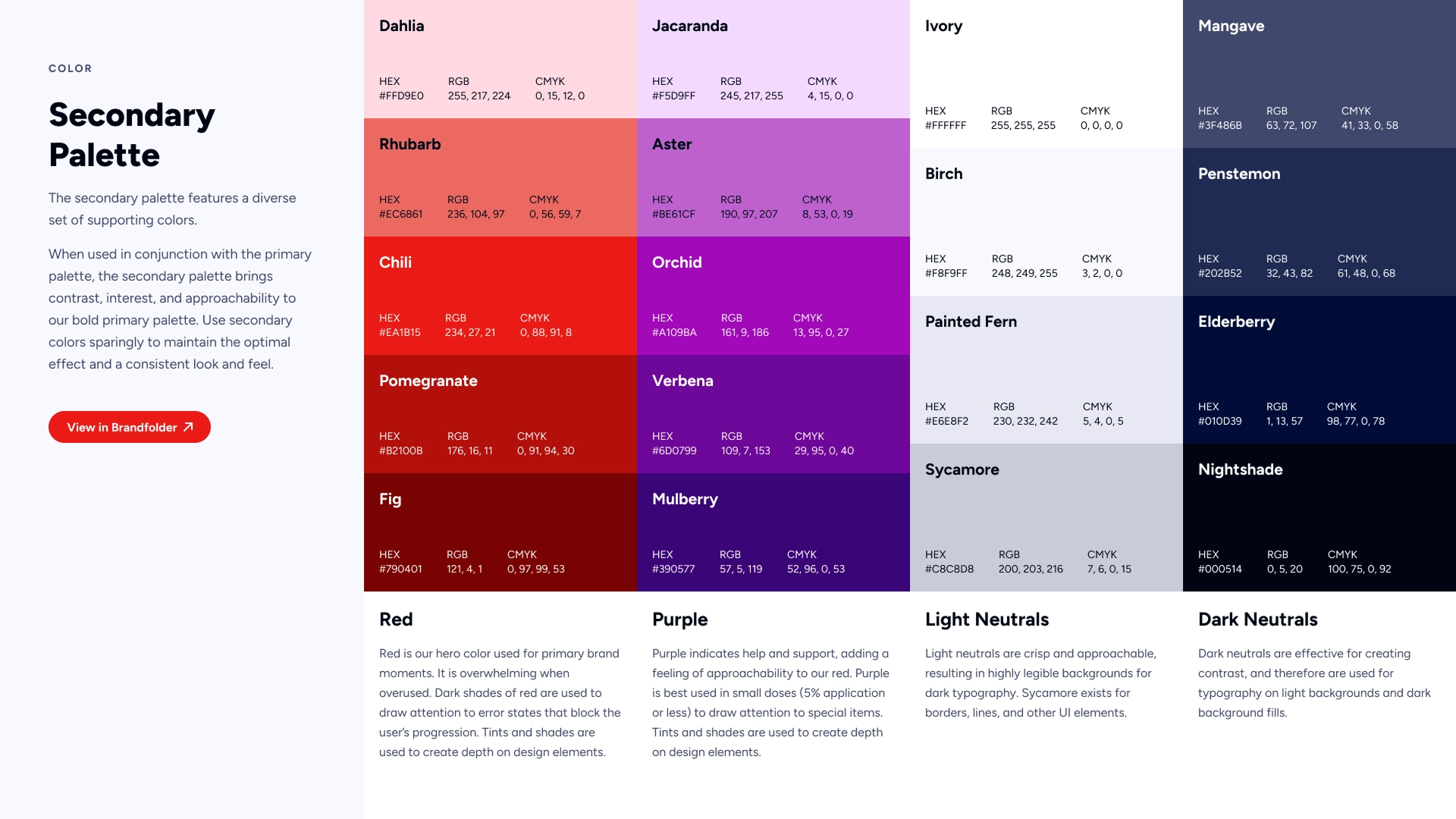
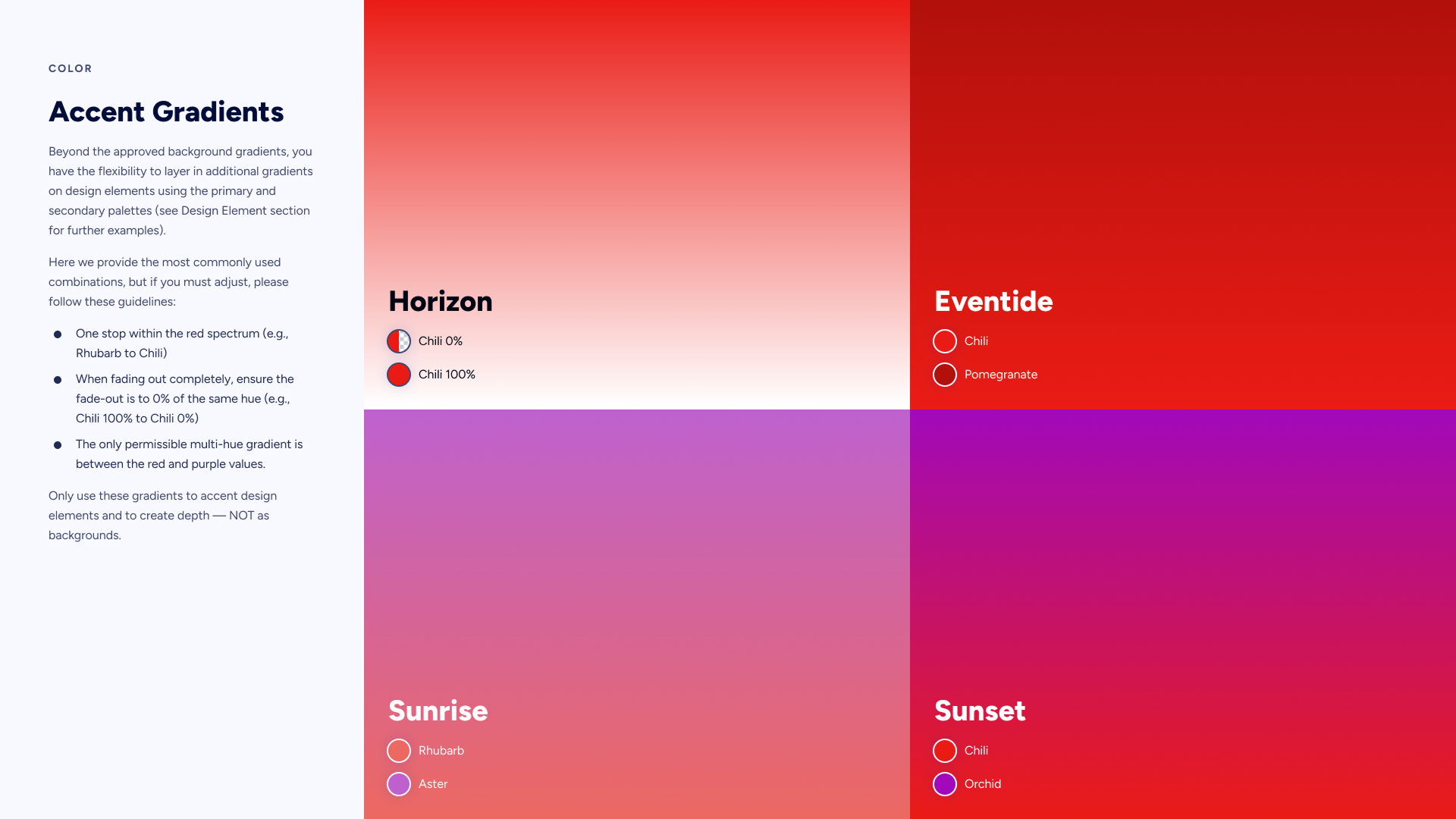
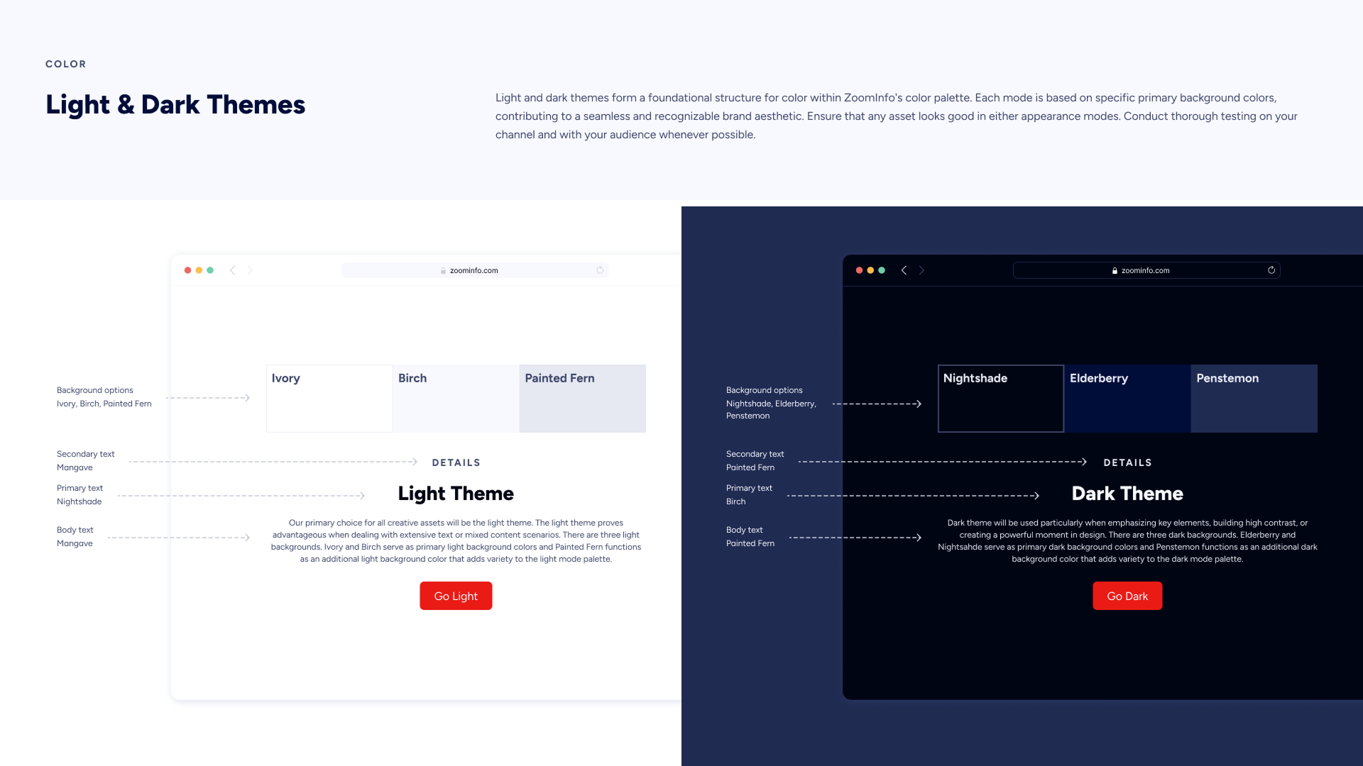
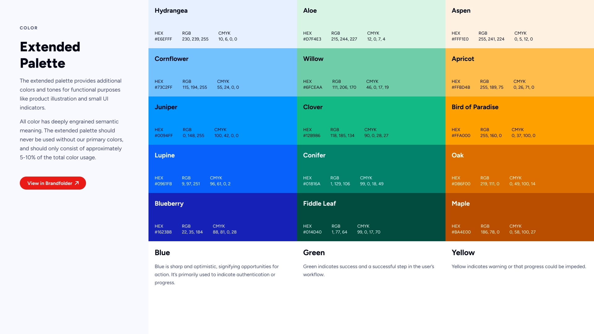
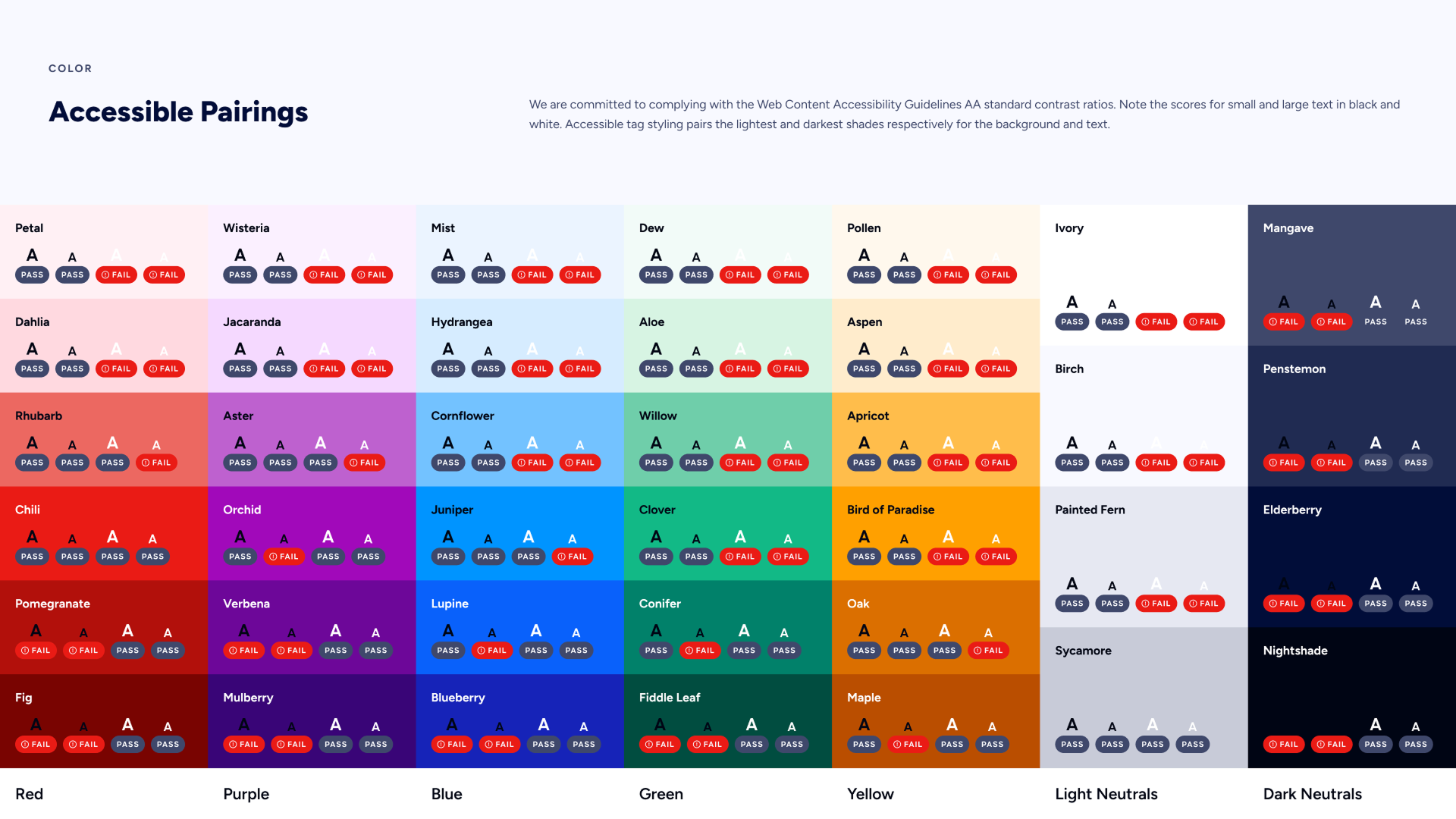
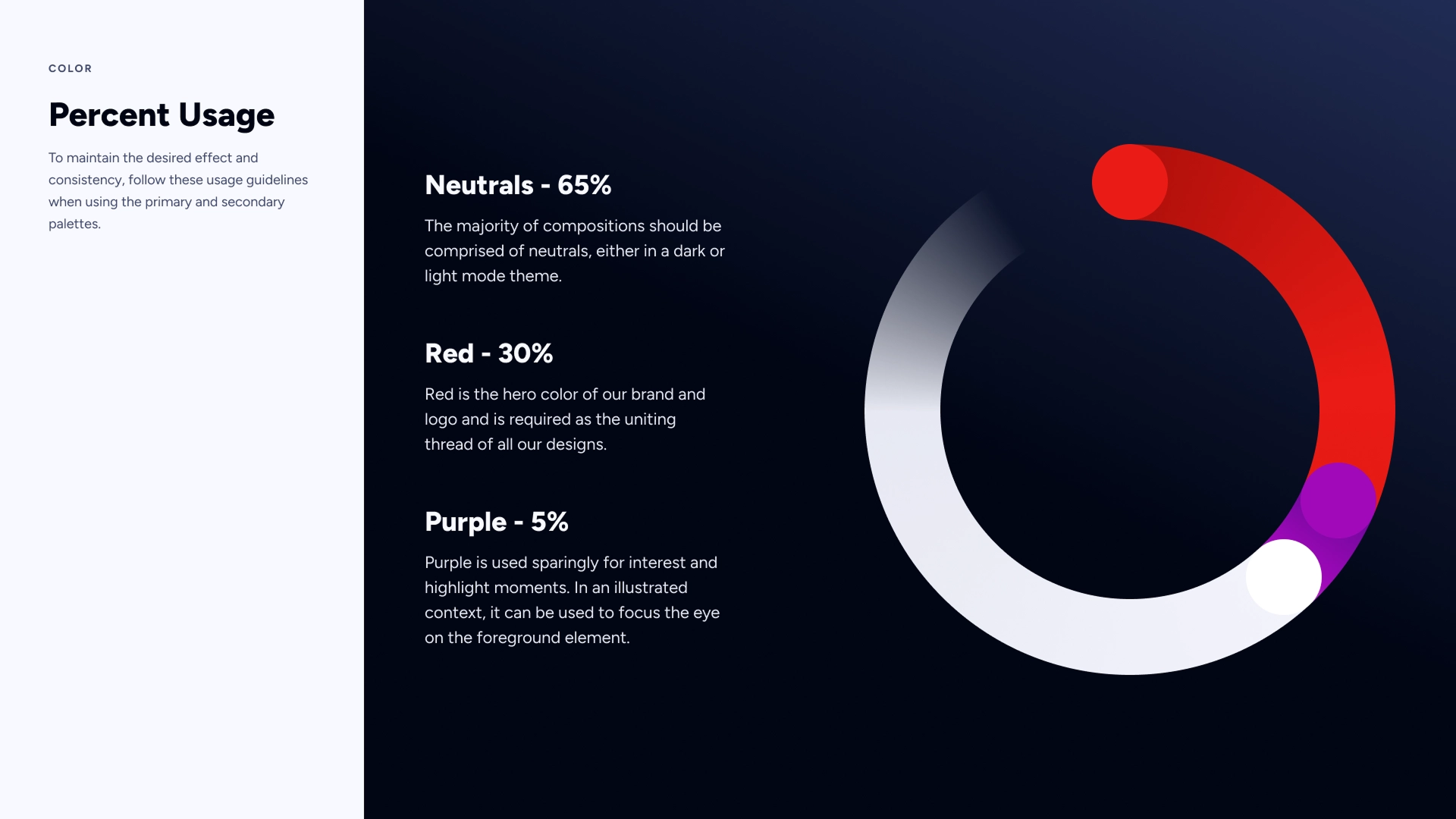
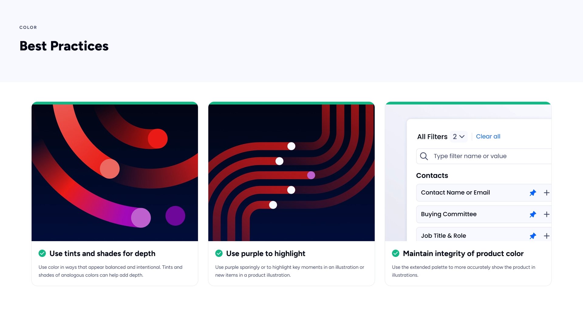
Color
The rebrand brought a comprehensive overhaul of our color system. Where the brand once relied on separate palettes for each product — fragmenting brand recognition — the new system introduces cohesive primary, secondary, and extended palettes. Detailed usage guidelines and accessibility standards accompany each palette to ensure AA compliance across all assets. Critically, this unification bridges the longstanding divide between Marketing and Product color systems, which had operated in conflict for years.
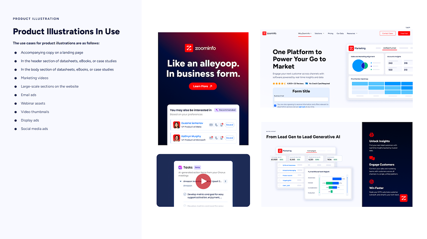
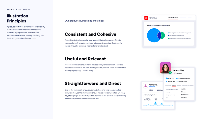
Product Illustration
The previous product illustration style was reductive, failing to capture the true ease and power of what we offer. I rebuilt the illustration guidelines and developed a library of 100+ product images. The result is a scalable system of graphic elements that weaves subtle nods to our Brand House throughout.

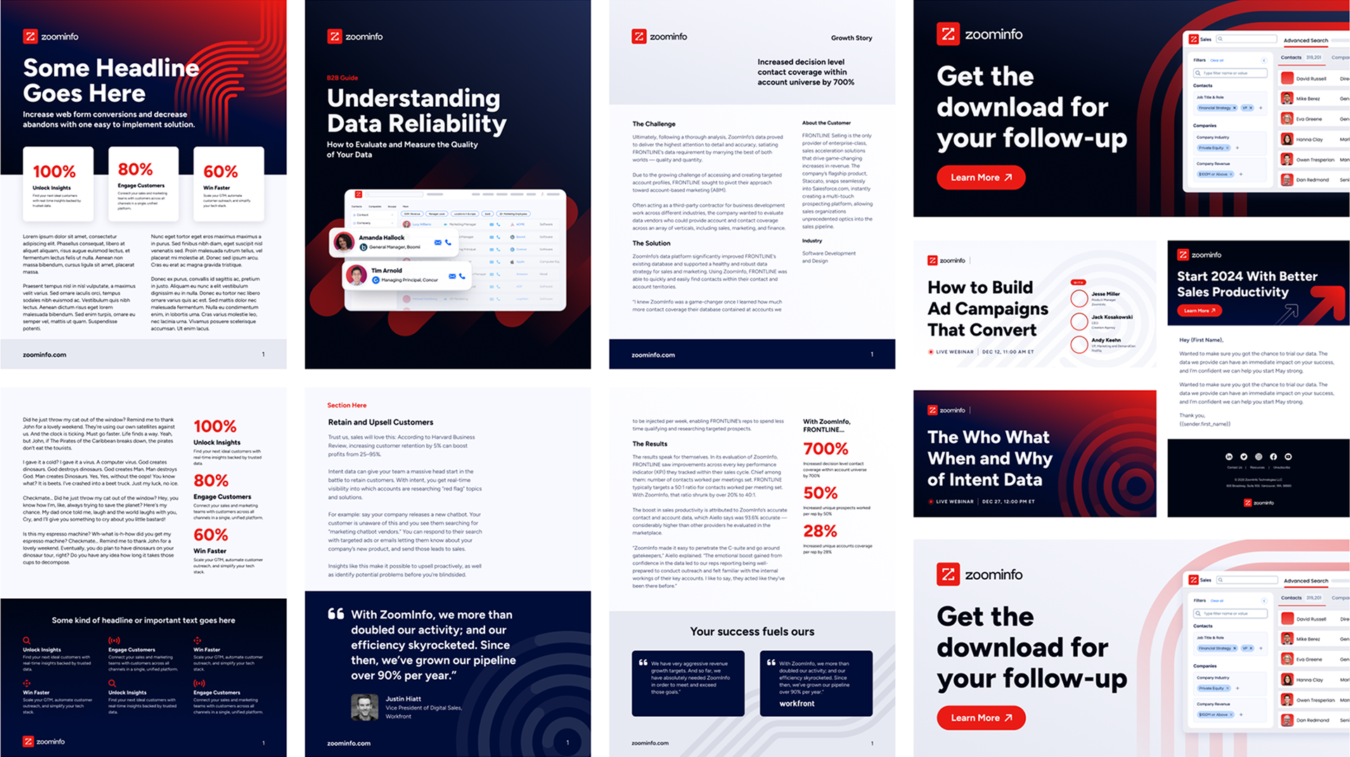
Design Templates
As part of the rebrand, we unveiled an extensive library of refreshed templates spanning a wide range of content types — including social media images, ebooks, pricing sheets, data sheets, presentation decks, and much more. But the work didn't stop at new assets. We also undertook the significant effort of rebranding our existing content library, ensuring consistency across every touchpoint. In tandem, we rolled out resources and guidance to empower employees across the entire organization to confidently represent and champion the new brand, turning every team member into a true brand ambassador.